Bathroom Remodel
Bathrooms can be tricky, especially kids bathrooms. Trying to juggle between what the kid’s needs are currently and what they will be in the years down the line. Teens have opinions and they are usually quite vocal! That isn’t just in Johns Creek and restricted to bathrooms. My boys were not that insistent about what the bathroom looked like, they just required space they could fit and move in. This project was more of my absolute need to get them out of my bathroom and into their own.
We have lived in our current home for over 9 years and it is no exaggeration to say that the bath/shower combo was never used more than once. Having spent most of my life overseas it was a real eye opener and shock to find Atlanta bathrooms (other than the master) sporting tiny tubs that only come up as high as your calf. What grown adult would actually use that tub? Can they actually fit in it? Apparently it is a thing throughout the US, especially in houses with multiple bathrooms. Who knew? Certainly not me. Let’s face it, bathrooms in Johns Creek are not limited to one or two per household as they are back in Europe so my boys had plenty of other options to choose from to shower in. The problem was they choose mine and, as kids do, they keep growing.
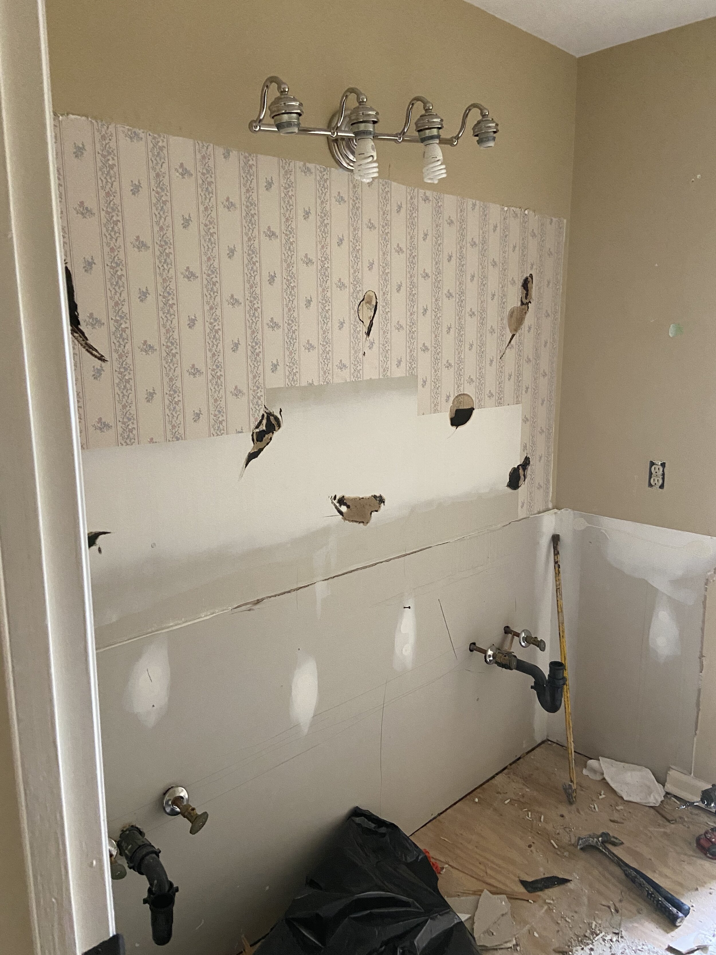
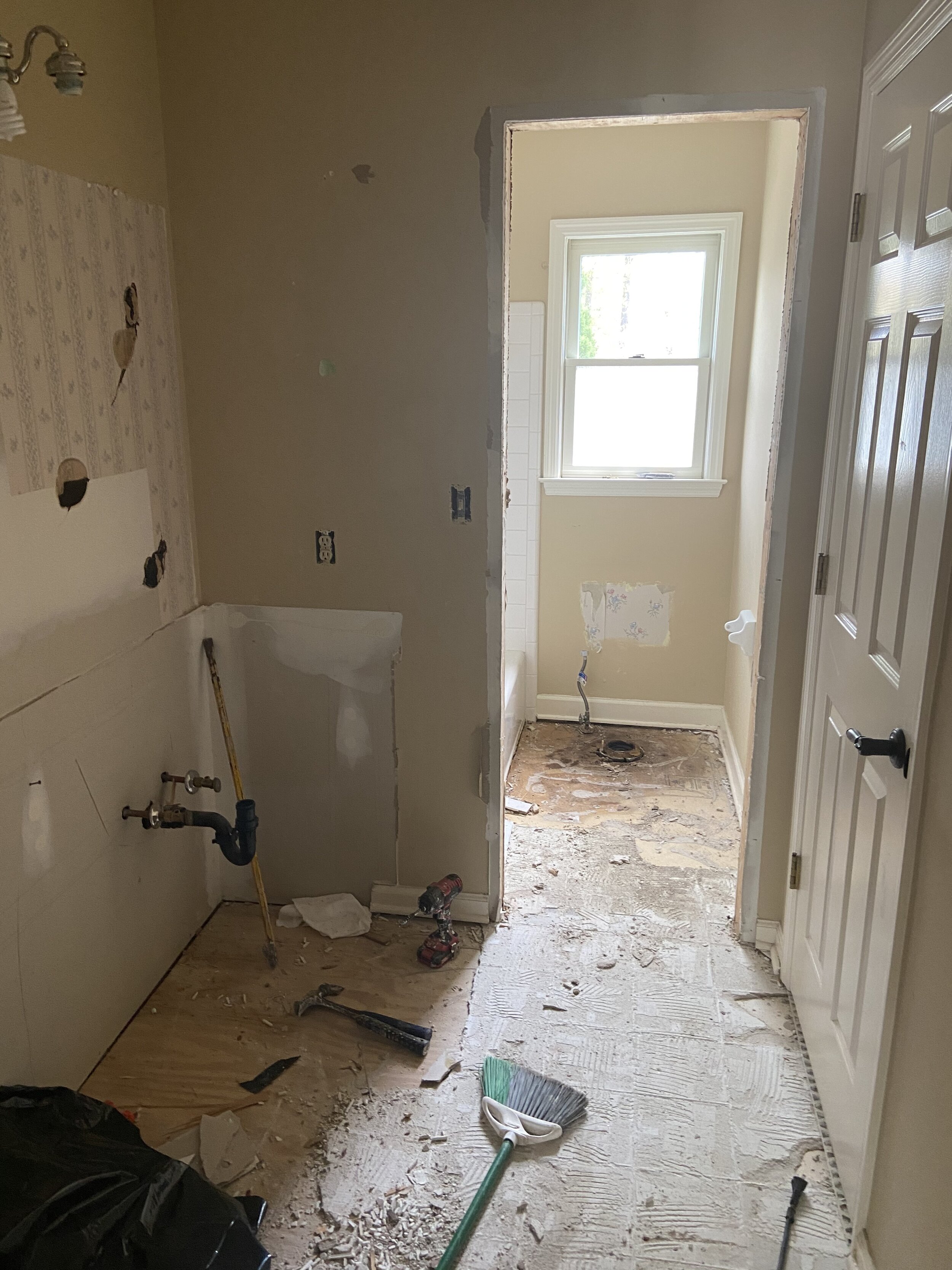
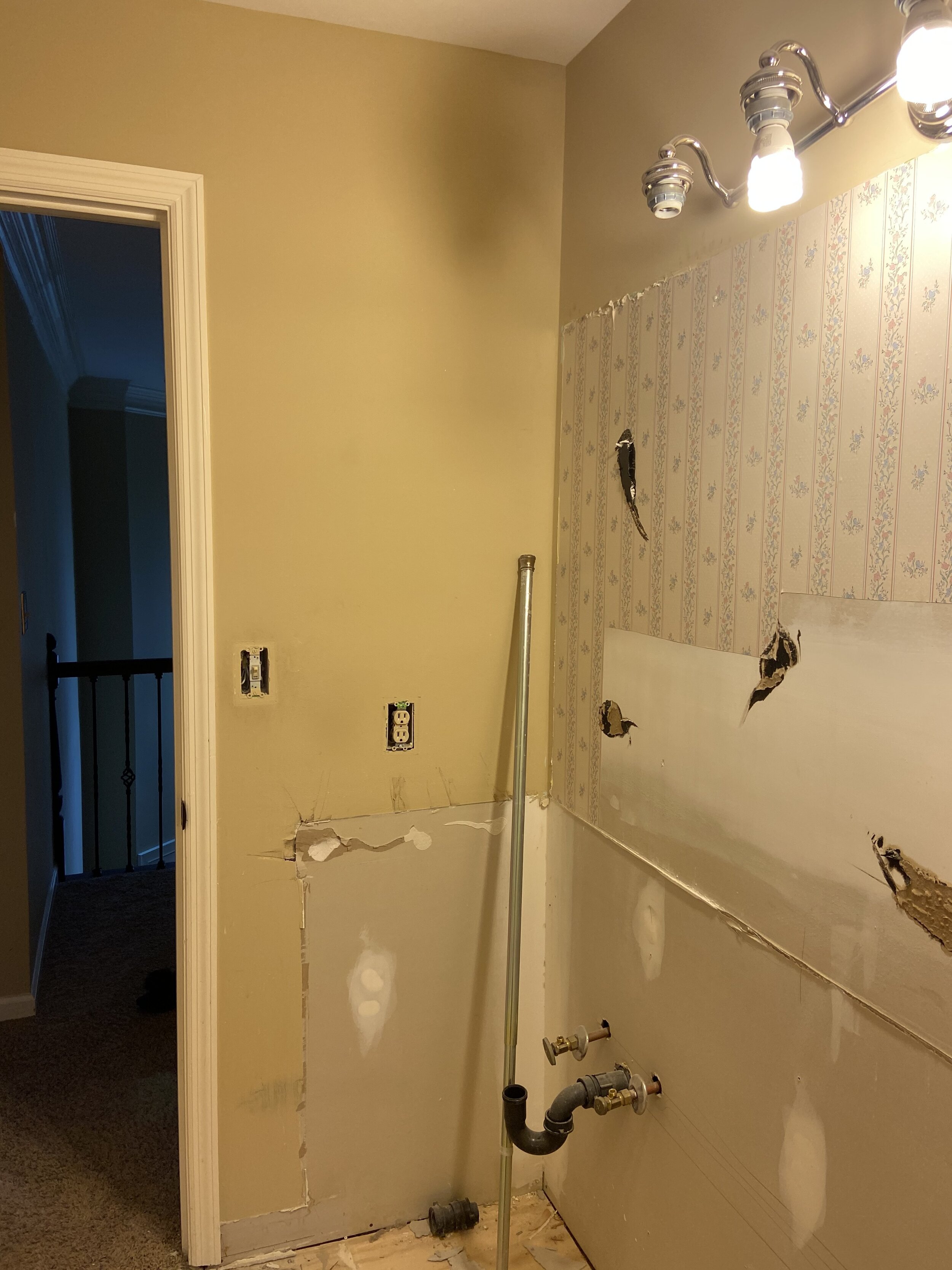
Before
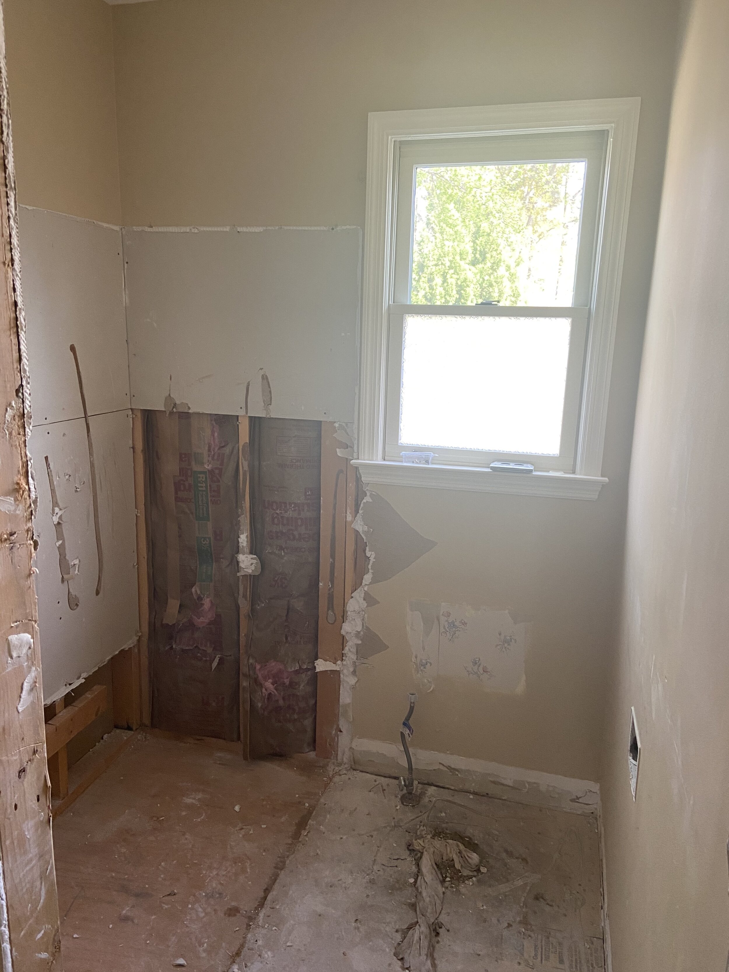
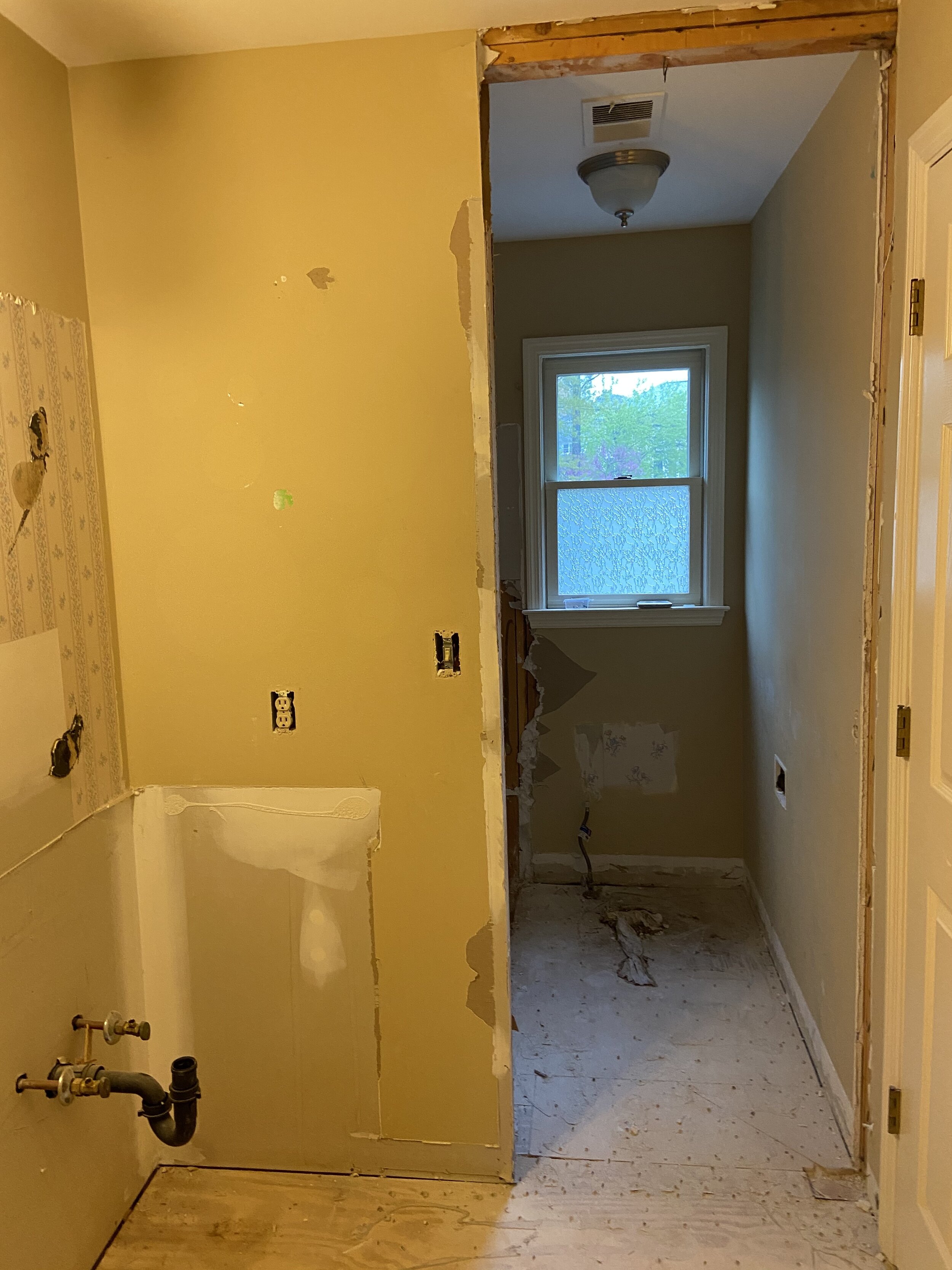
My boy’s bathroom layout was pretty typical for a standard Jack and Jill bathroom or one attached to a kid's bedroom. Vanity with two sinks, a tub (albeit tiny) with shower and toilet. Sounds great but to be truthful it wasn’t functional. The layout was long and thin, rectangular, so although it was big enough for two people to share it really didn’t have enough space for movement and flow. The toilet and tub/shower were enclosed at the far end of the bathroom with a secondary door closing it off. Literally, making it the most awkward space to be in. I certainly didn’t push them to shower there as it felt so claustrophobic for myself. I know it felt worse for a 15 year old that is 6ft 1 and still growing and a 12 year old that is following in his brother’s footsteps.
REMOVING WALLS AND OPENING SIGHT LINES
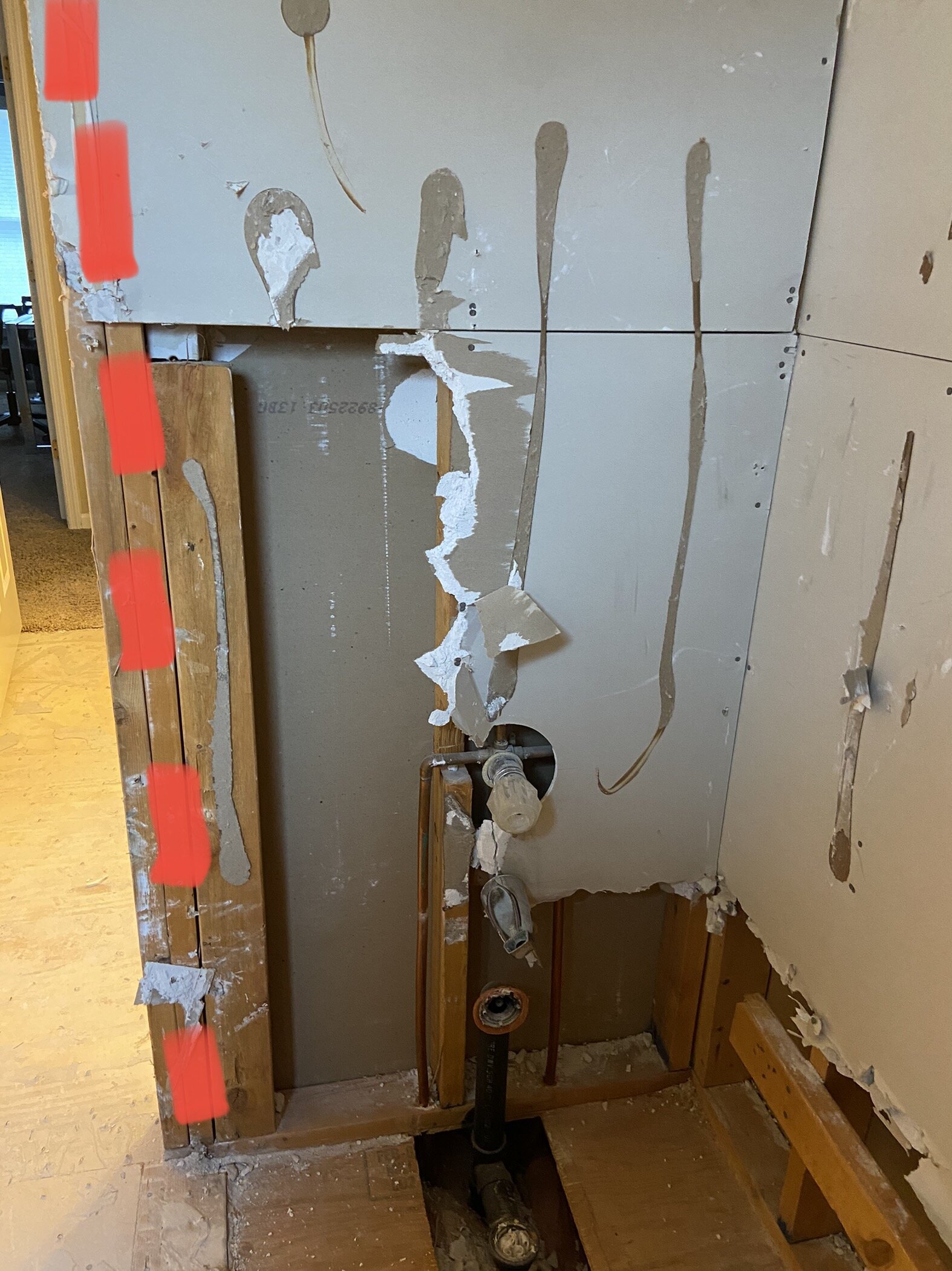
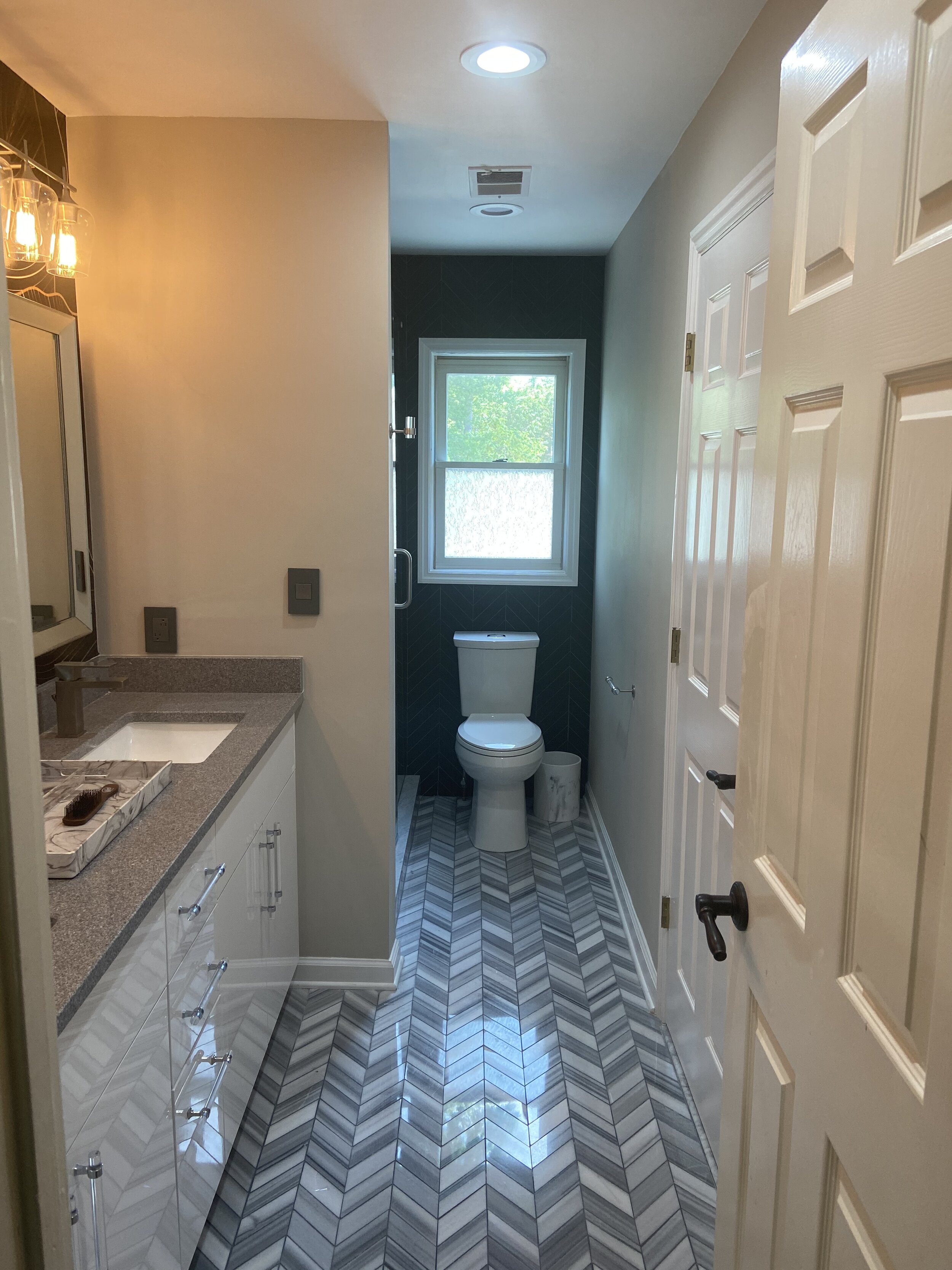
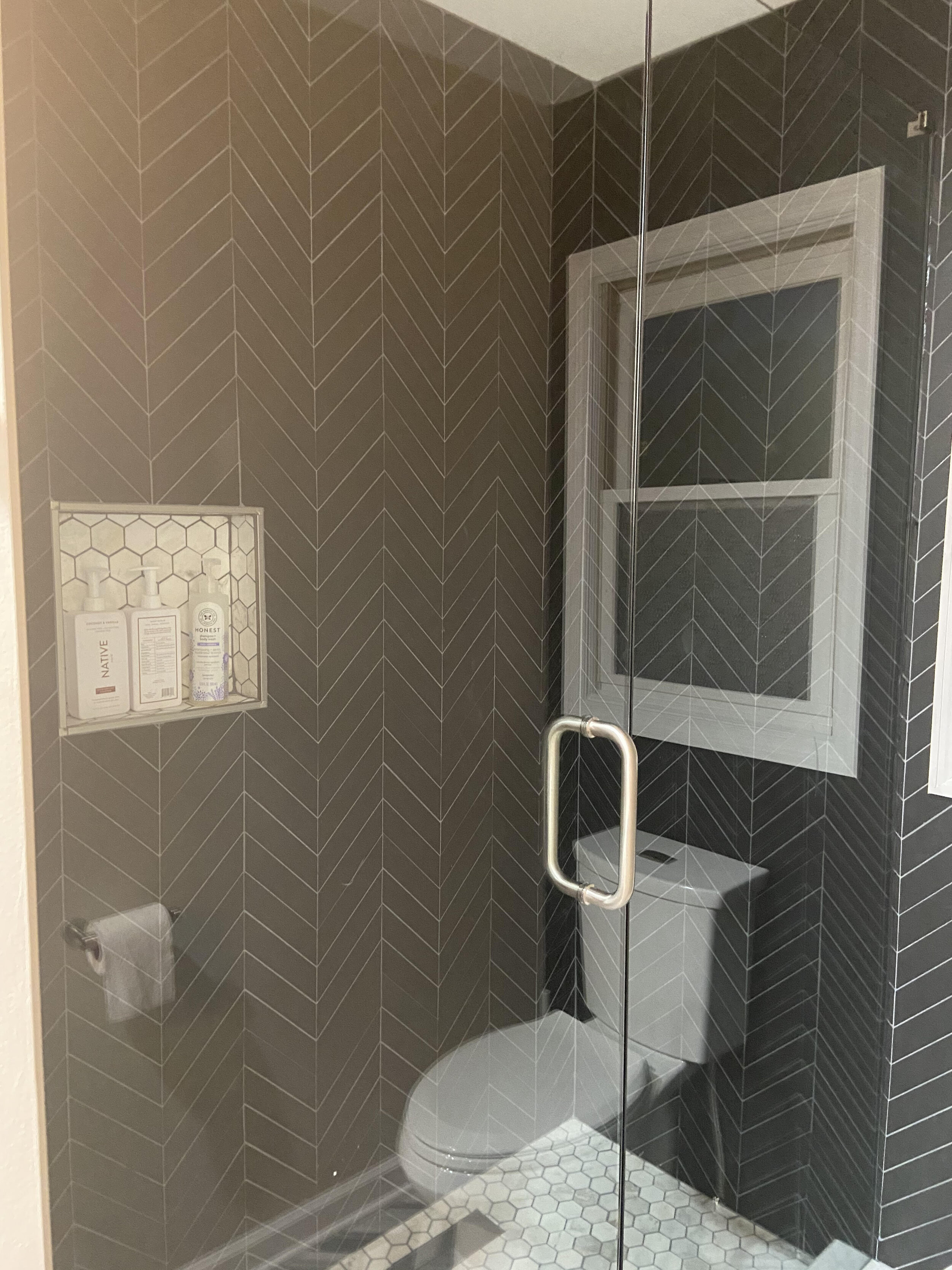
The most obvious way to increase space in the bathroom was to remove the secondary door. It really was not necessary and it certainly was not being closed at any time. By removing the door frame and part of the wall there was greater visibility to the room and helped make the room function as one unit rather than two separate identities.
INCREASING FUNCTIONAL SPACE AND THE ILLUSION OF SPACE
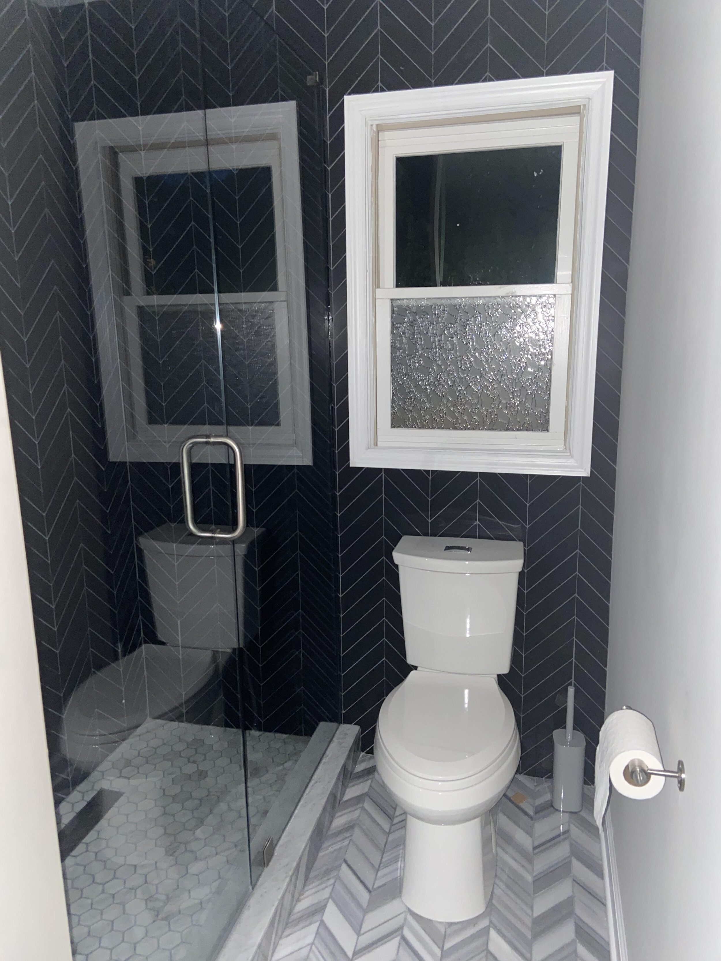
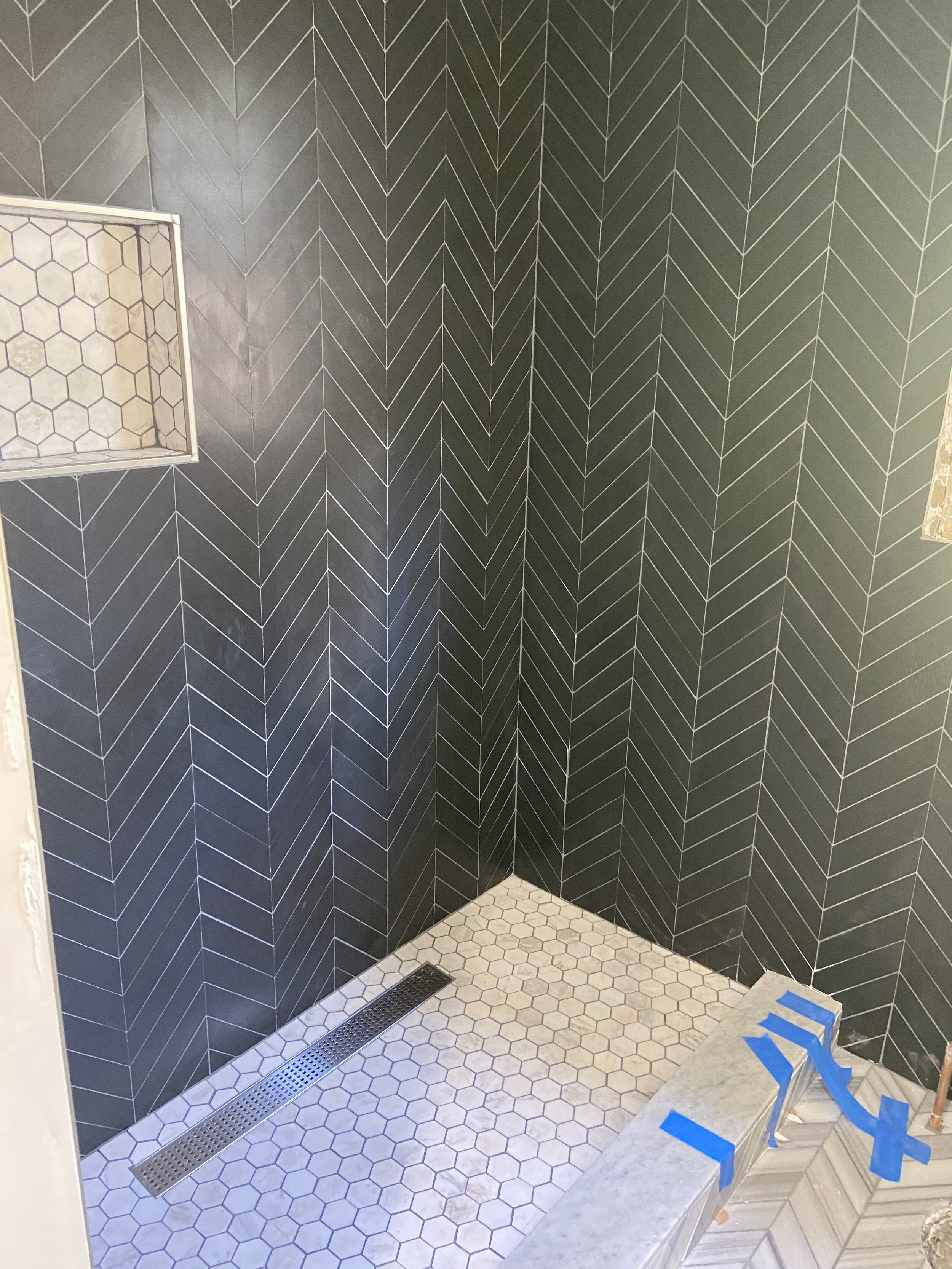
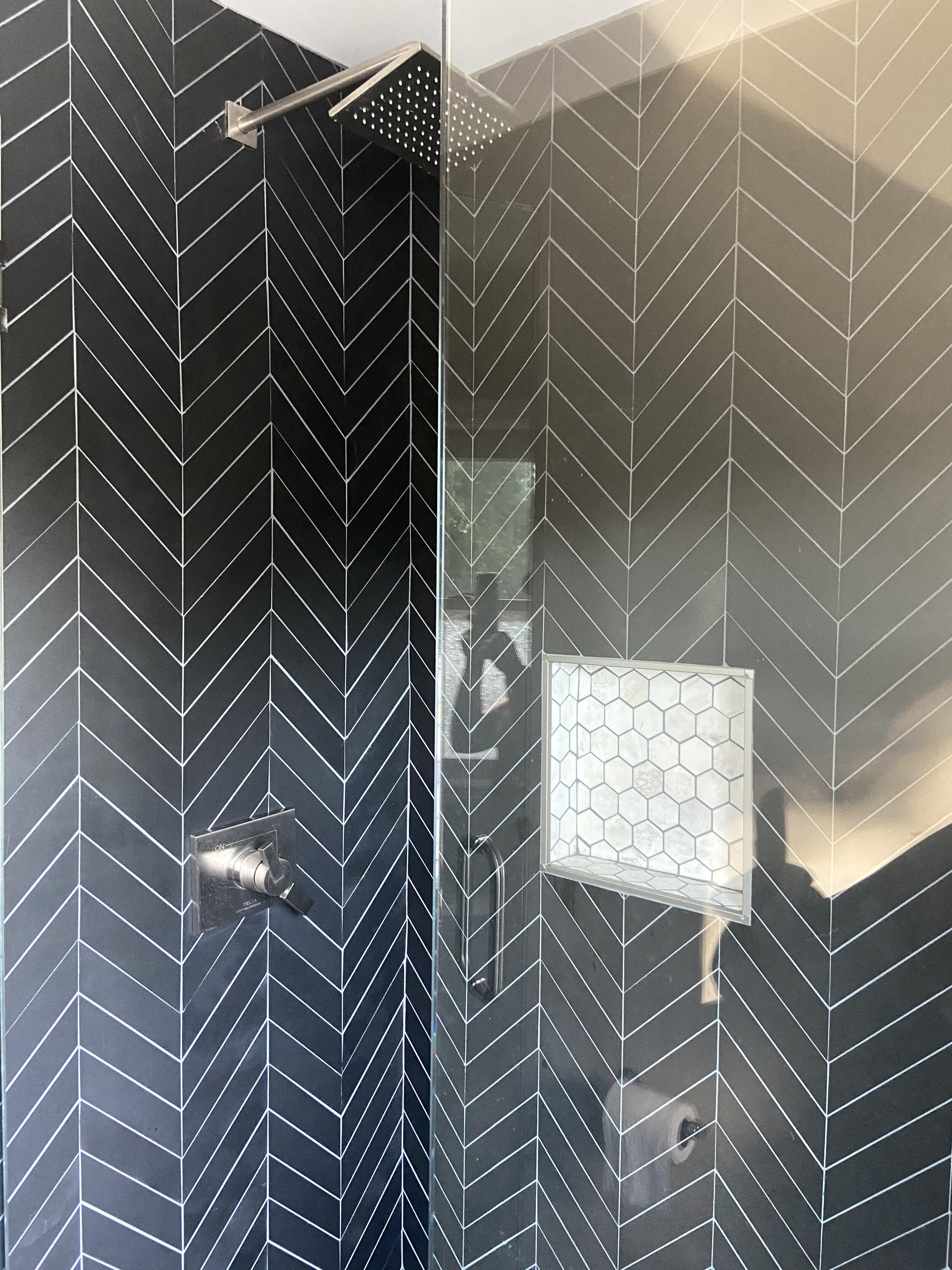
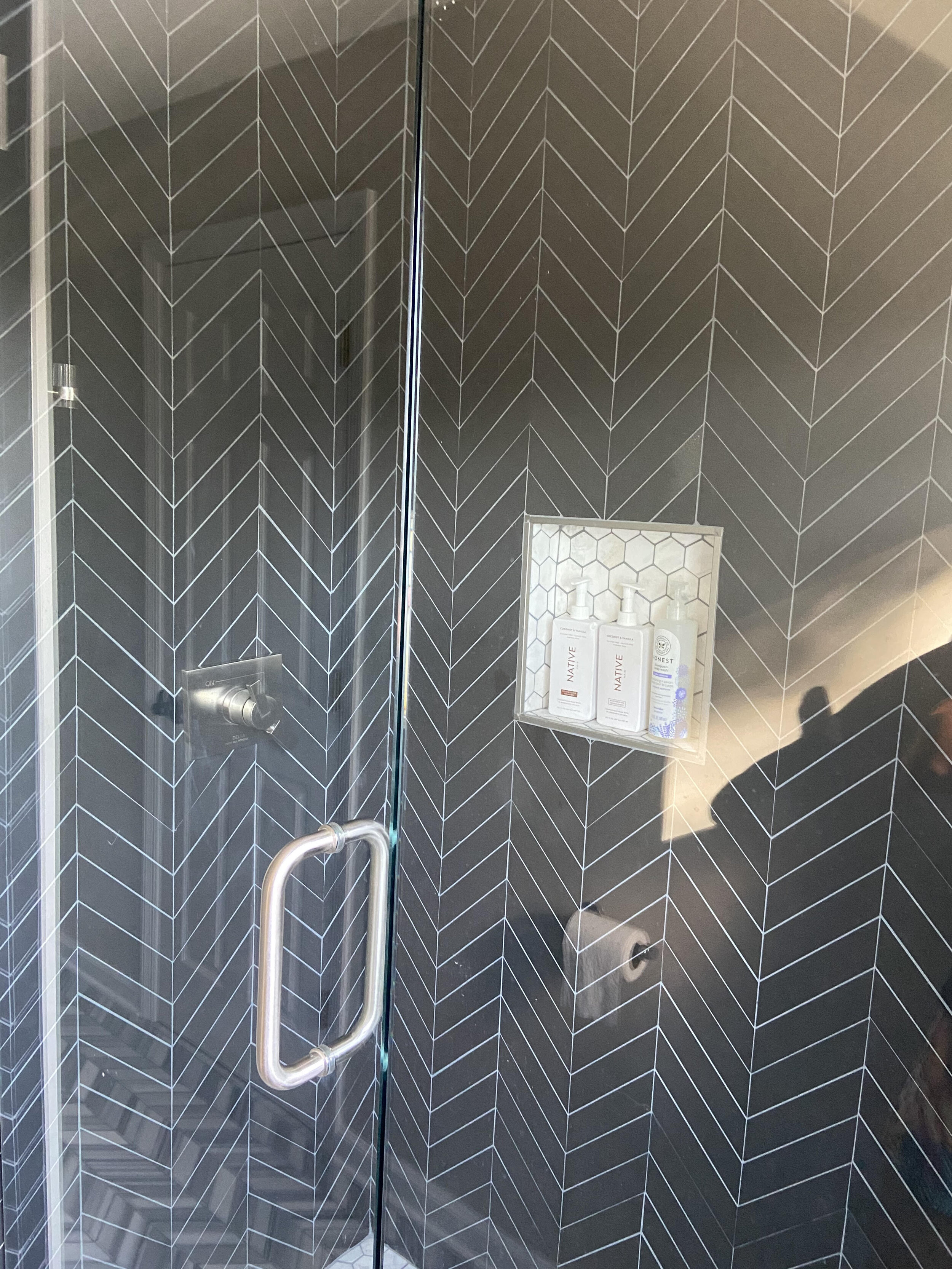
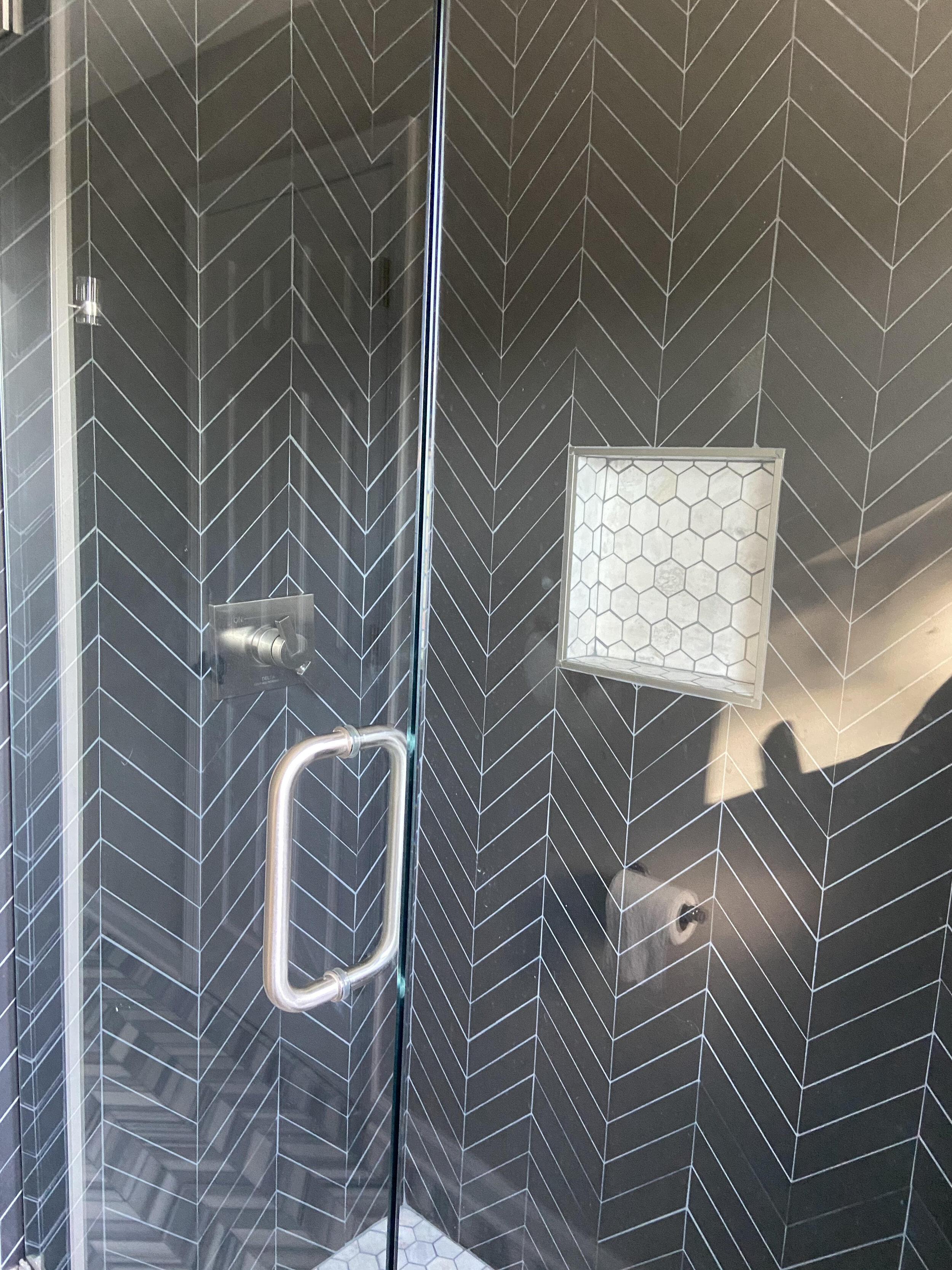
By removing the miniature tub and replacing it with a shower provided extra usable foot space allowing for ample room and flow. Extending the tile across the back wall served two purposes in the design plan. Not only did it prevent the wall from looking stunted where the tile would normally end in the enclosed shower, the dark color choice also has the illusion of bringing the wall closer than it actually is. The purpose here was to make the room look boxier and wider rather than thin and elongated. By choosing a frameless glass shower door visually the eye is drawn to look through the glass and distort the depth perception of the space. Again helping to make the area look and feel larger than it really is.
Replacing the wider older toilet with a narrower sleeker option again helped to increase the space in this back part of the bathroom.
COUNTERTOP AND VANITY
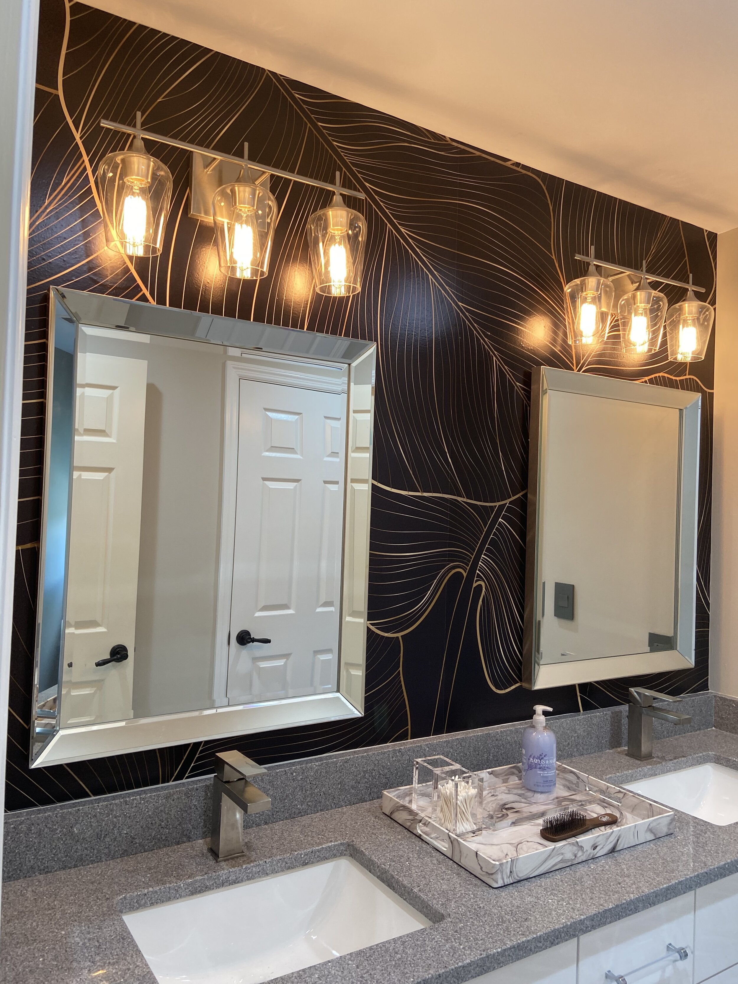
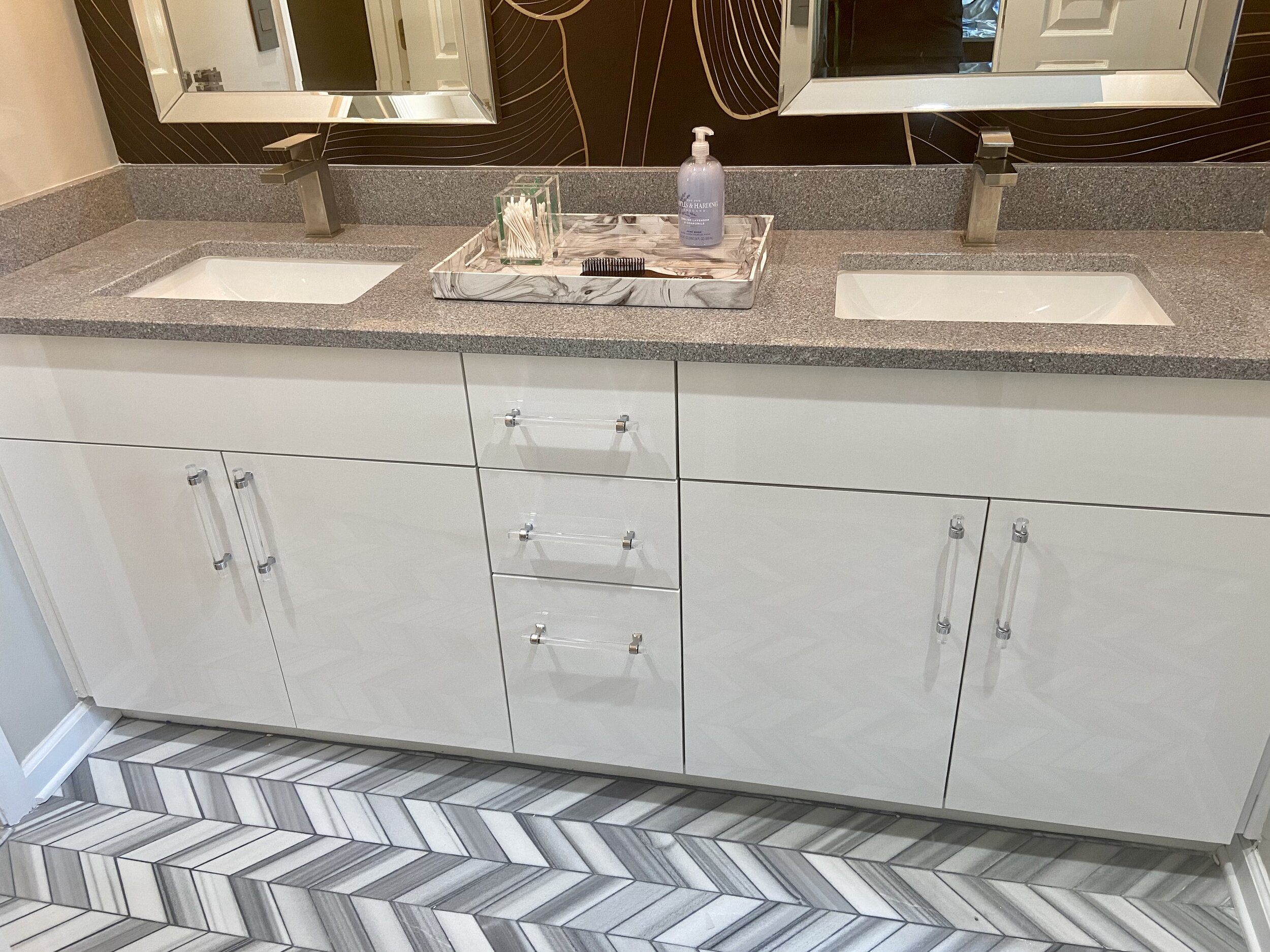
Due to the shape of the room and the existing plumbing from the previous vanity it made sense to keep the replacement in the same position. New flush white cabinets were installed with acrylic pulls for a clean contemporary look. Grey granite countertops were installed. The flexed grey was deliberate in a vain attempt to hide toothpaste stains that my boy’s make! Yes, it actually was a consideration in the design plan not only to look beautiful, perform the function well but also to hide blemishes.
TILES
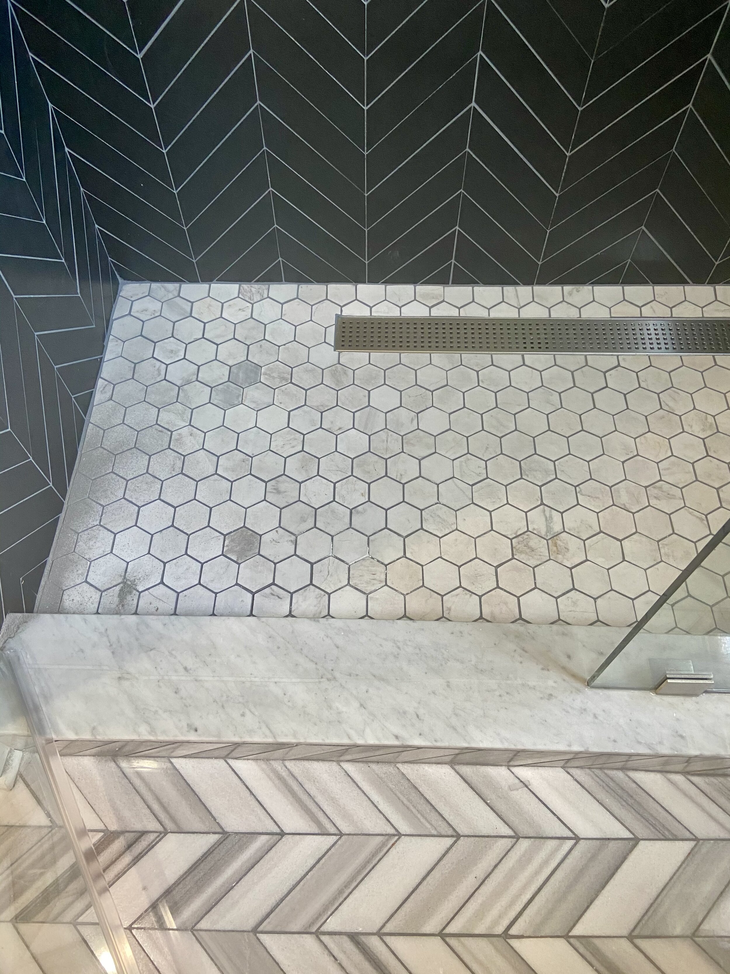
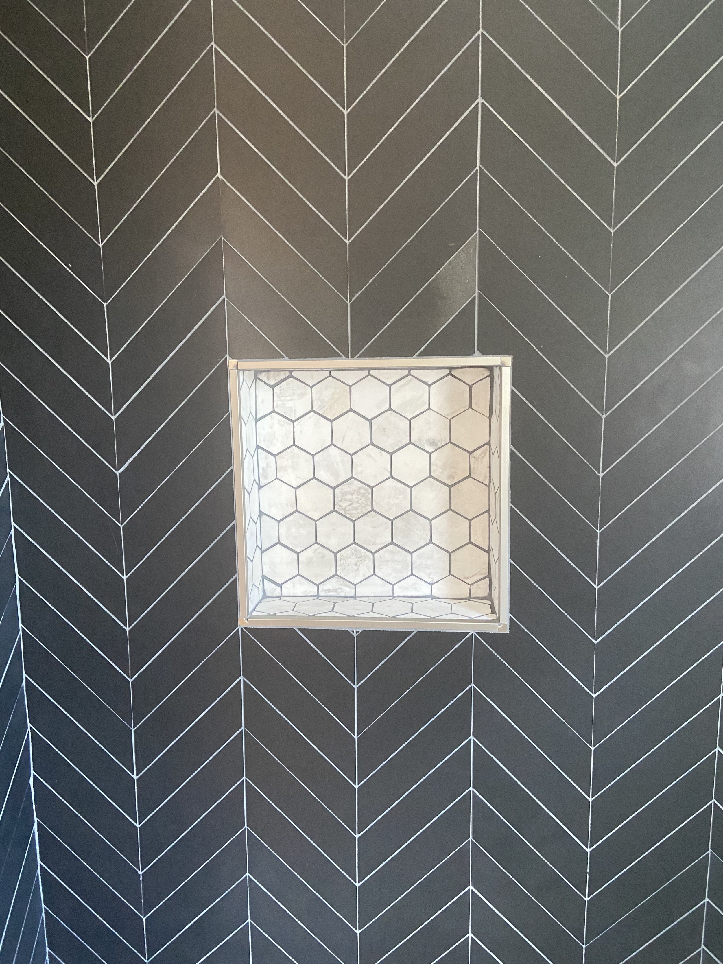
Large black/grey chevron tiles were selected for the visual impact and statement that they conjur. The larger tile was able to repeat the pattern in the bigger shower area and back wall. Just as the black wall tiles were chosen not just for their style but also their color, the same was also true for the floor and shower floor tiles. Light grey and white marble tiles were placed side by side in order to add interest and the appearance of texture but also to fool the eye into believing that the space again was larger than it really is. By keeping to the same color hues for the shower base, the floor does not appear to abruptly end where the shower starts but more of a continuation with different tile.
FINISHING TOUCHES
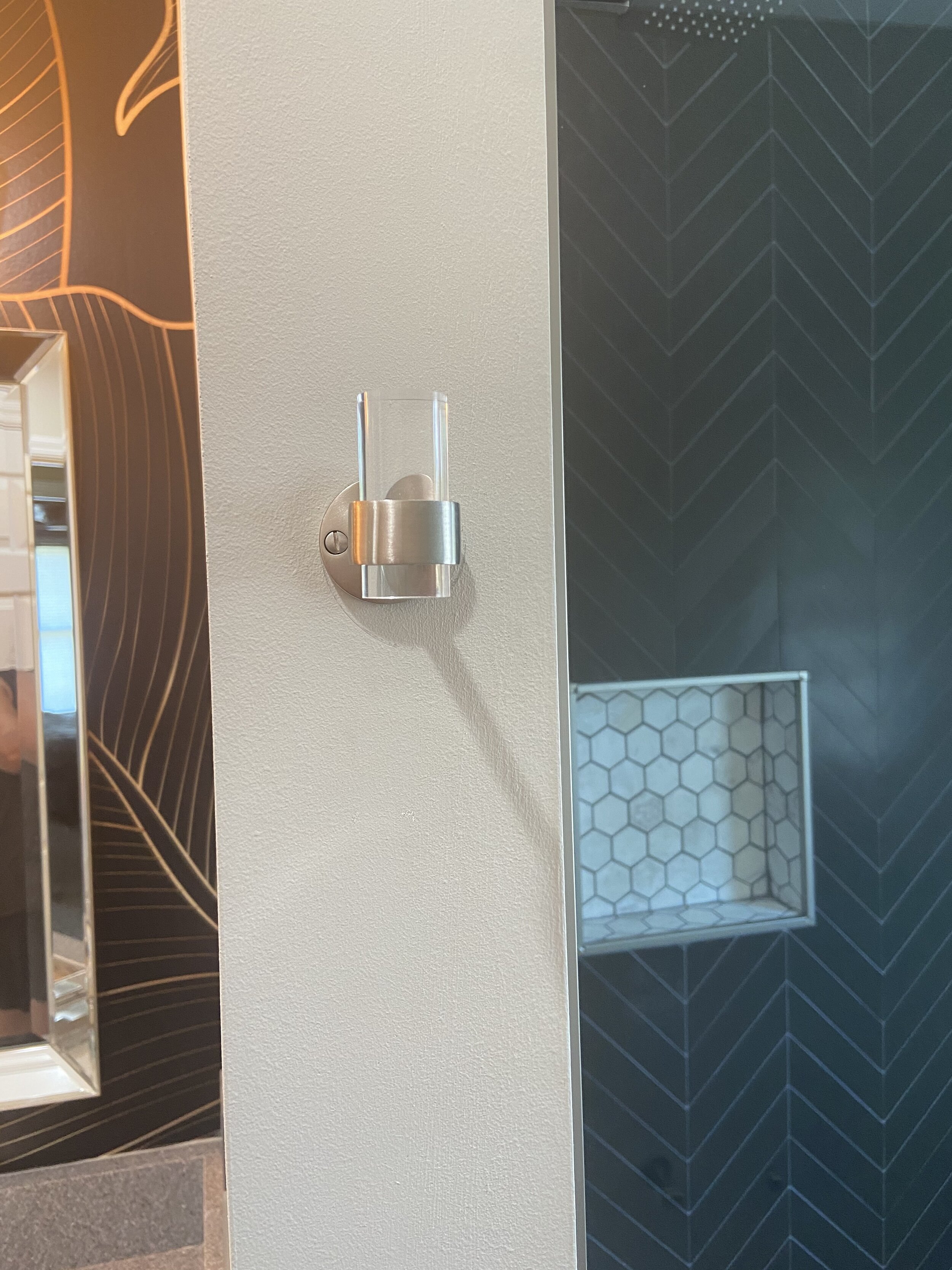
This may be a teen bathroom but that is not to say that they won't be using this bathroom as adults. And who is to say that teens don’t enjoy an air of sophistication too? Adding a large scale wallpaper with a black and gold print above the granite and vanity gave the touch of drama, preventing an overly sterile look in the bathroom. Mixing metals with the silver mirrors and the gold wallpaper helped contribute to a contemporary aesthetic with flair to balance the serenity of the floor tile choice. Statement lighting completed the look with task lighting over the basins. Details are what complete the overall look. They can make the difference between a well put together room and a room that still looks half polished. Acrylic toilet roll holder and towel hook by the shower, updated wallplates are the little details that sometimes get overlooked, but really shouldn’t.
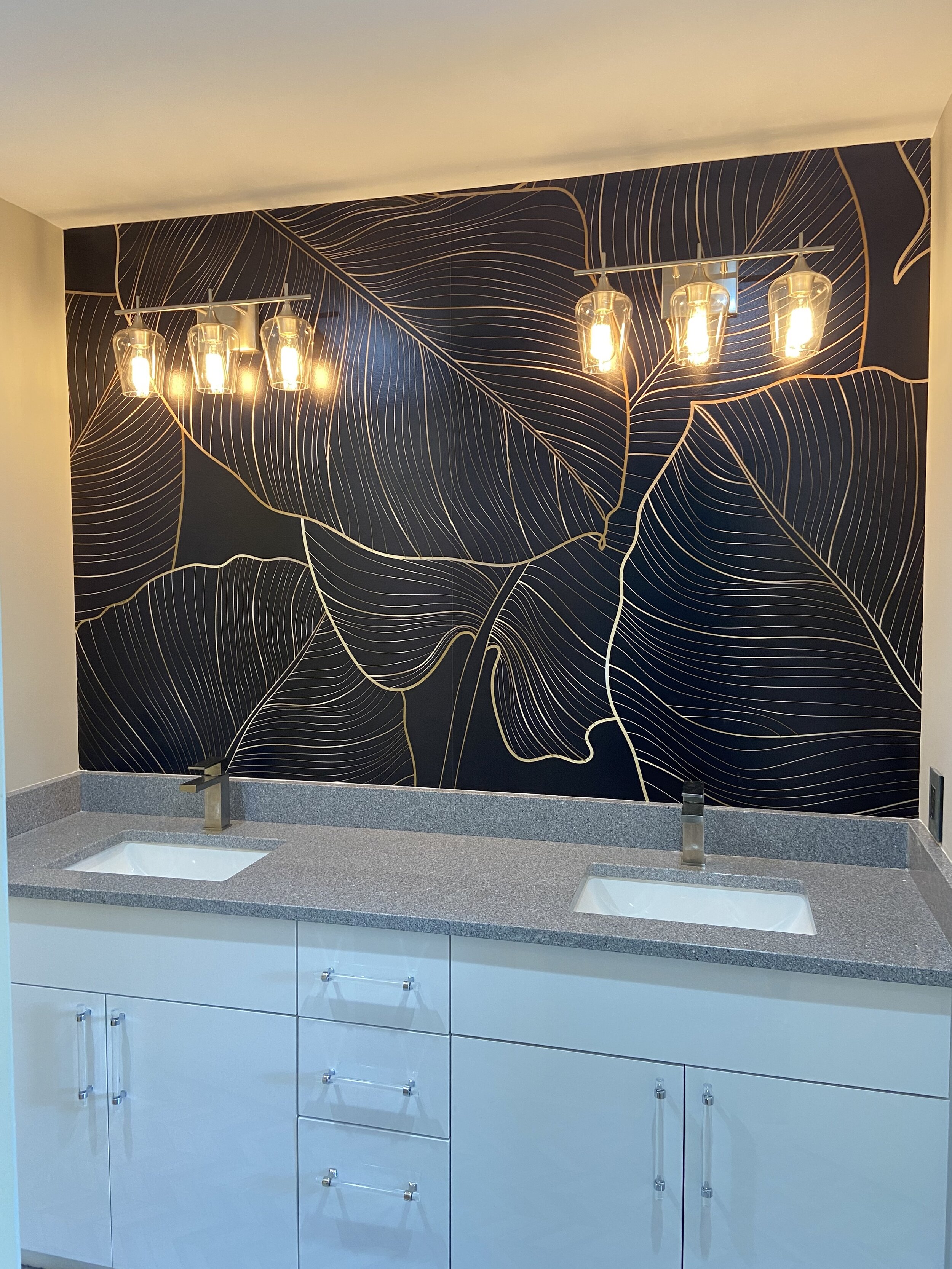
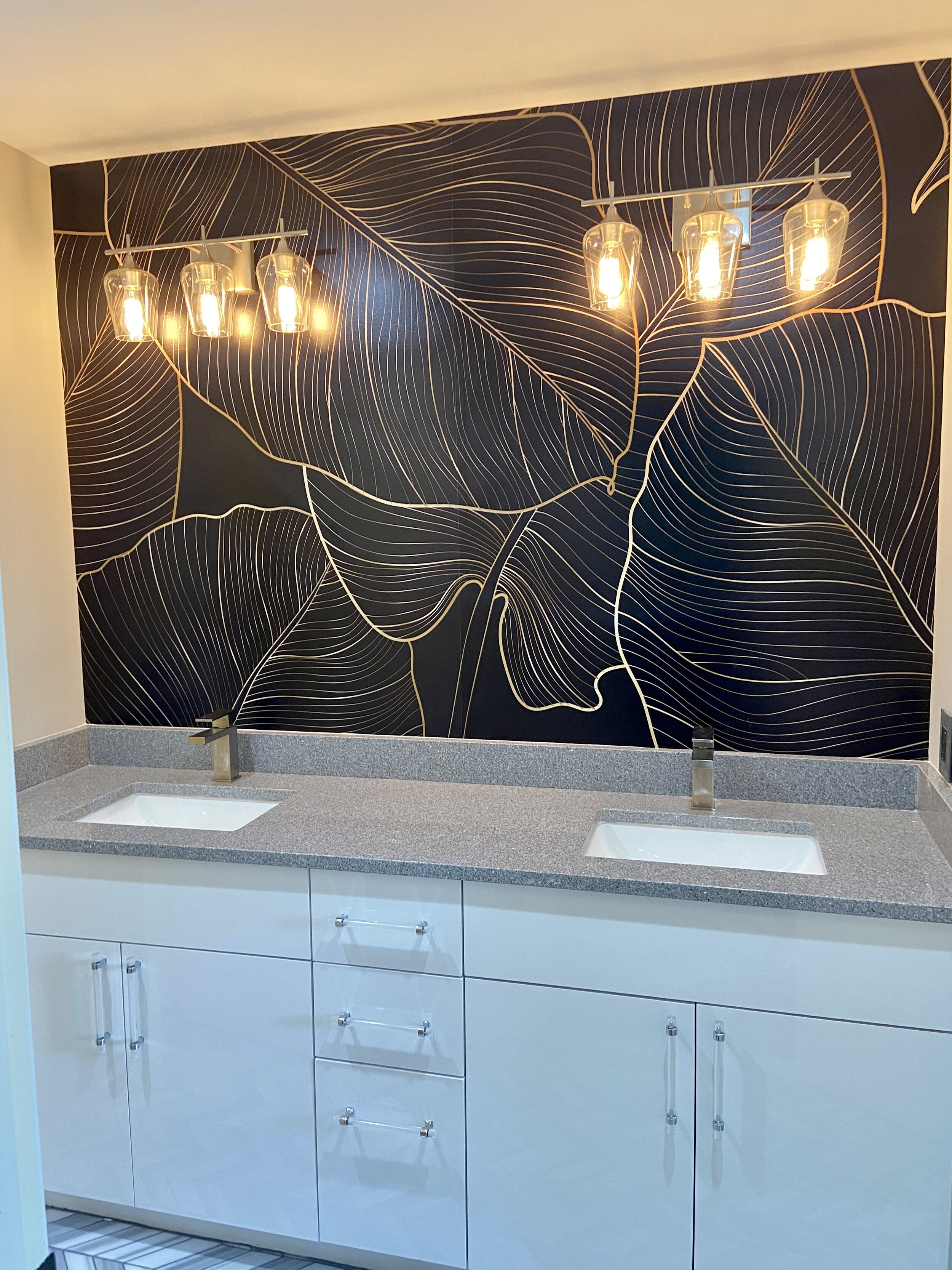

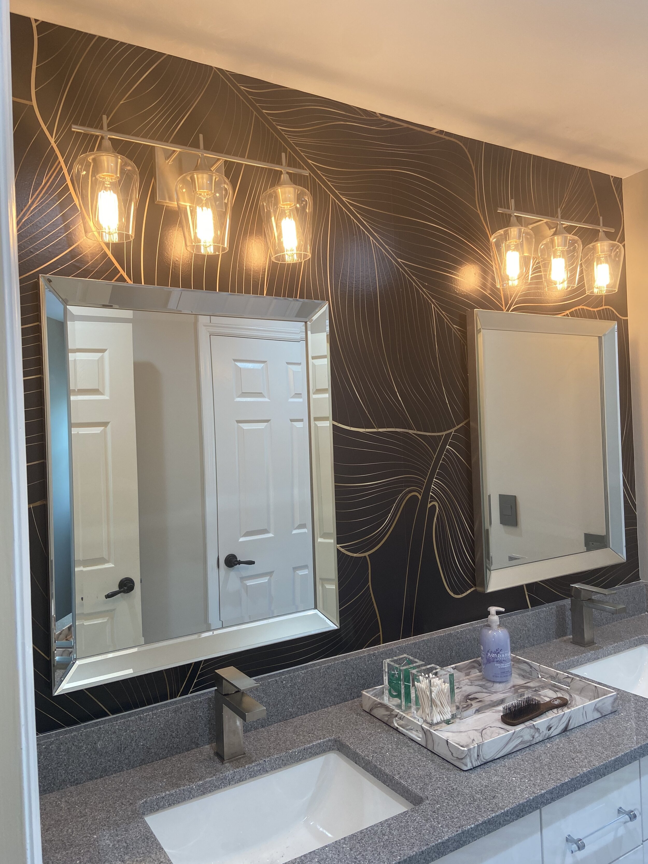
All in all my boy’s bathroom ended up looking stunning, yet functional and at the same time without breaking the bank. I was able to reign myself in and remind myself that it was a kids bathroom. The trick is to find a way to project quality and style whilst working within the limitations of the space (and budget). Success story, so much so I would happily shower in their bathroom. Not that they want me in there!



If you are thinking about a bathroom remodel, masterbath, kids, guest or even powder room. Give 3cheekybirds a call. We would love the opportunity to work with you and design a bathroom that you can love and enjoy.
CLICK HERE to schedule an appointment.


